
Gradients have made a dramatic comeback in digital design, evolving far beyond the flat-color era that dominated the previous decade. Modern gradient usage is sophisticated, nuanced, and purposeful—creating depth, dimension, and visual interest that flat colors cannot achieve. Understanding current gradient trends helps designers use this powerful tool effectively while avoiding the dated pitfalls of earlier gradient revivals.
From Flat to Rich: The Gradient Renaissance
The pendulum swing from skeuomorphism through flat design has settled into what designers call "rich design"—interfaces that have depth and dimension without being literally skeuomorphic. Gradients are central to this aesthetic, creating subtle surface variations that make digital elements feel more tangible and less like perfectly flat rectangles.
This doesn't mean gaudy multi-color gradients on every element. Modern gradient usage tends toward subtlety—gentle shifts in lightness and hue rather than dramatic color jumps. Buttons with subtle gradient treatment, cards with faint gradient backgrounds, icons with gradient fills. The gradients are present but not overwhelming, enhancing rather than dominating.
Mesh Gradients and Complex Color Fields

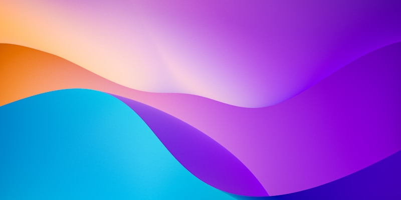
Mesh gradients represent the current peak of gradient sophistication. Unlike simple linear or radial gradients, mesh gradients use multiple color points that blend organically, creating effects that resemble light passing through translucent surfaces or the complex color variations in sky photography. Creating true mesh gradients requires specialized tools, but the effect has influenced broader gradient aesthetics.
The influence of mesh gradients appears even in simpler implementations. Backgrounds that blend multiple colors in organic-seeming arrangements, using multiple overlapping gradients to create complex color fields. These techniques achieve some mesh gradient complexity with more accessible CSS or design tool features.
Duotones and Color Fusion
Duotone effects—typically applying a gradient map to grayscale images—have evolved into more complex color fusion techniques. Rather than simple two-color mappings, modern approaches blend multiple hues in ways that preserve image structure while introducing sophisticated color treatment. This creates distinctive visual signatures that brands can own.
The technical implementation often involves mixing the original image color with overlay gradients using blend modes or opacity variations. The result maintains photographic clarity while introducing the color sophistication that gradients provide. This technique works particularly well for hero sections, where distinctive color treatment creates immediate brand recognition.
Animated and Dynamic Gradients
Gradients increasingly move, creating ambient, dynamic backgrounds that respond to user interaction or simply evolve continuously. Subtle gradient animations—shifts in color stops, gentle rotation of gradient angles, slow color transitions—create living backgrounds that add energy without distraction. CSS animation capabilities make these effects increasingly accessible.
Interactive gradients respond to mouse position or movement, creating responsive color shifts that feel magical. These effects require careful implementation to avoid performance problems and should enhance rather than distract from content. The best interactive gradients are subtle enough that users notice something pleasant without identifying the specific technique.
Strategic Application
Whatever gradient style you choose, strategic application determines success. Gradients work best when used with restraint—as accents and highlights rather than dominant surface treatments. Reserve dramatic gradients for hero sections and focal points; use subtle treatments for secondary elements. The goal is creating visual interest that draws attention appropriately, not gradient saturation that exhausts the eye.
Accessibility considerations apply to gradient usage. Ensure sufficient contrast between text and gradient backgrounds. Test across different displays, as gradient colors can appear significantly different on various screens. Consider how gradients render on devices with reduced motion preferences, as animated gradients should respect these settings.
Conclusion
Gradients in 2026 are sophisticated, subtle, and strategic. The gradient revival isn't about returning to skeuomorphic excess but finding the appropriate middle ground—interfaces with dimension and visual interest that flat design lacked, without the heavy ornamentation that skeuomorphism imposed. Master these techniques by studying contemporary design, practicing restrained application, and always prioritizing user experience over visual novelty.